Keeping a company “on brand” and “on season” can be deceptively hard. A well-functioning brand relies heavily on consistency in its design choices to create cohesion and establish a sense of trust and familiarity with the consumer. The customer however, carries a certain expectation that a brand keep up with trends and the changing times. Here are 5 brands that creatively solve the problem “How to keep it fresh while staying the same.”
1. Copic Marker
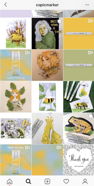
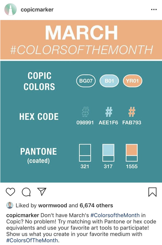
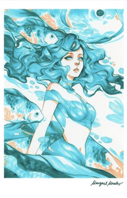
Copic Marker is a brand that really knows who it is and more importantly, who their customer is.They have created the perfect solution to this challenge by utilizing their social media audience and consumer base into their seasonal marketing strategy. Every month, Copic employees put together the campaign: #ColorsoftheMonth. Which is a three-color set of markers that embody the seasonal mood of the upcoming month. They release the colors via a short gif on their Instagram, along with the HEX codes for digital designers under the hashtag #ColorsoftheMonth. The selected markers are always offered at a discounted rate for the month, along with additional bundle items to encourage additional purchasing. They then ask artists to post and tag their #ColorsoftheMonth creations for a chance to have their piece shared on the official Copic social feeds. The result is a beautiful, color coordinated grid that engages users, encourages buying, and expertly plays to both the strength and creativity of their brand.
2. Oreo
“Milk’s Favorite Cookie” takes the cake (or cookie in this case) as far as adapting to each season while staying on brand. Everything about their branding design is simple, clear and consistent throughout the year. From the classic Oreo Blue and Black to the playful Sans Serif fonts, they’ve expertly created a social media presence that’s instantly recognizable, before you ever see a cookie. The one area in which the brand provides change is with their animations. By adapting a vectorized cookie into a seasonally specific animation, Oreo creates the idea of fresh and fun design while keeping their core aesthetic consistent.
3. Swatch
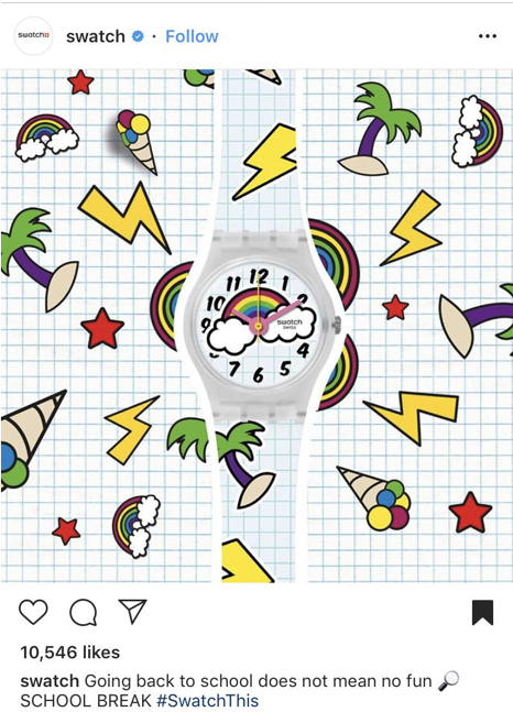
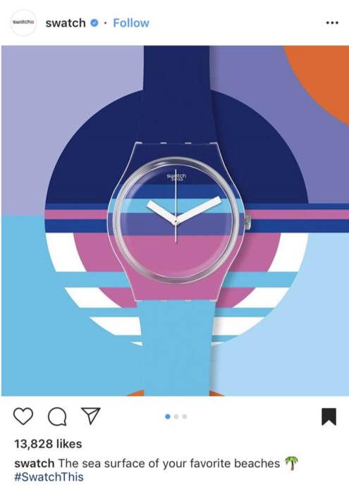
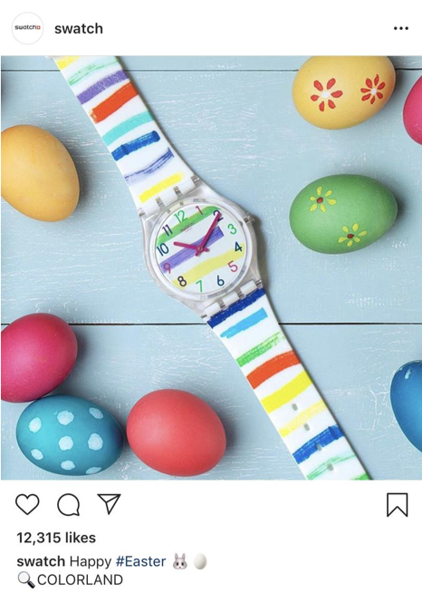
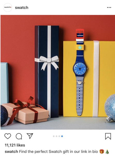
Swatch is no stranger to using creative design to sell a product. In fact, that’s kind of Swatch’s thing.Therefore, it’s no surprise that the Swiss watch and accessory brand is an expert at melding recognizability with new ideas to ensure their feeds are eye-catching all year round. Swatch understands that the most recognizable aspect of their brand is the shape of the watch itself. As far as creative content, they capitalize on the fact that they aren’t afraid to switch it up and make bold design choices. When you think of Swatch, you think of bright colors, bold patterns, but most importantly, you think of change. By keeping only the image of a watch consistent and pulling from their ever-evolving designs, they have put together a branding style that seamlessly provides their consumer with freshness and familiarity from season to season.
4. Lush Cosmetics
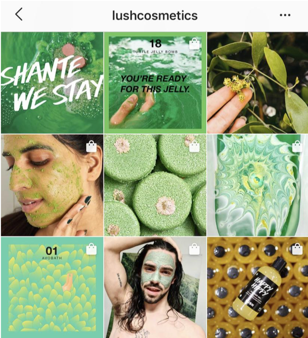
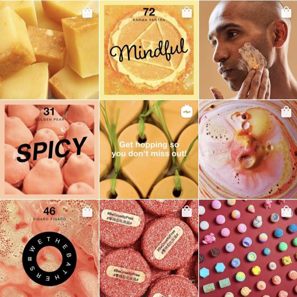
Just like their ingredients, Lush keeps it simple and clean when it comes to their social media. The all-natural health and beauty brand applies the same philosophy that makes their products so appealing to their seasonal social media design. Lush customers feel a sense of pride in buying from them and the company has built a loyal empire based on transparency and celebrating ingredients in their truest, raw form. This same celebration of natural beauty is expertly on display as you scroll through the company’s Instagram. Season to season, they choose a color story that reflects both the time of year and the products that are currently “in season”. From face masks to soaps to photos of flowers, Lush has designed a beautifully curated color story that lets their ingredients shine.
5. OPI
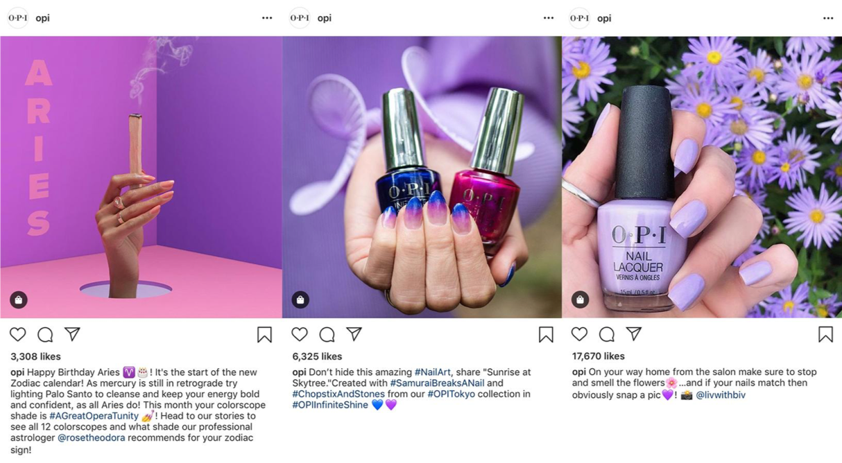
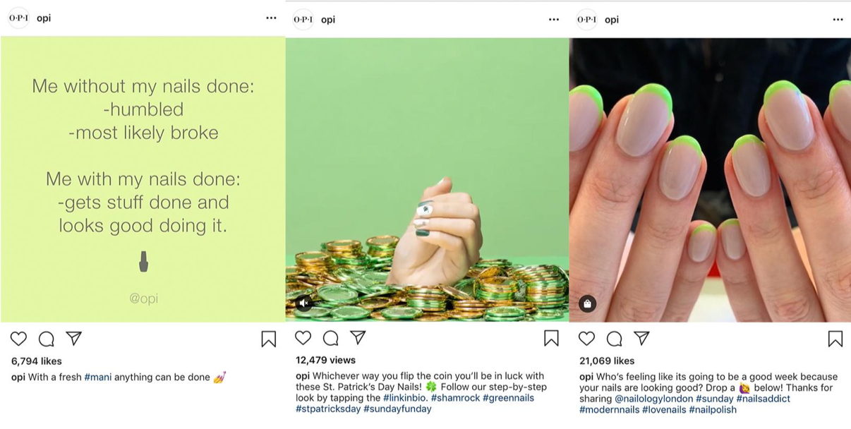
OPI is masterful when it comes to using color to design new and playful ways to engage with consumers. Each week they highlight different nail polishes by showcasing a color family worn in a variety of ways and designs. They then use those colors as a common thread throughout the posts for that week. Sometimes it’s as a simple background, other times they’ll stage a whimsical flat lay or photo. The end result is a cheeky and enticing social media presence that perfectly highlights the products and the season.

