Holy Barrage of emails! Between Thanksgiving, Black Friday, Cyber Monday, and Giving Tuesday, retailers are hell bent on making sure you see their promotions, sales, and holiday gimmicks.
I love receiving retail email around the holidays, but that’s probably because I’m an email marketer, and I look at the emails for so much more than just the deals they’re pushing that day. If I wasn’t, I’m pretty sure I would have felt totally overwhelmed and quite annoyed at the sheer volume of emails that came through my inboxes day and night for 5 days straight.
After much review, here are the 3 best and 3 worst holiday emails I’ve received. Just like my Spring email review, I will grade each email on Subject Line, Relevance, Creative, & Call-to-Action (CTA).
*editor’s note: The emails were delivered as one consistent email. They’re chopped up for ease of use on this blog.
Who Made The Nice List?
1. Marc Jacobs
Subject Line: B+ You’re Welcome – It’s a little unclear what you’re going to find in this email, but it’s intriguing enough that you want to check. And then it pays off when you see they are saying you’re welcome for the 40% they’re offering
Relevance: A The email clearly states it’s a holiday sale, so there’s no confusion there. Gifts are listed first underneath the creative because most people will be searching for gifts this time of year.
Creative: A- The creative is simple and classic. It exudes festive holiday time without hitting you over the head with it. They include the website nav bar below the creative, so if you know exactly which department you want to shop in (Gifts Women, Men, etc) you can go there directly.
They include all of their social media properties without cramming them down your throat because they know that if you’re receiving their emails, you are more likely to engage with them on their social platforms as well.
CTA: A Because the email is designed so cleanly, it’s very easy to understand the action Marc wants you to take, shop the sale. It’s simple, but it works.
2. Bloomingdale’s

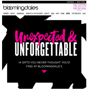
Subject Line: A- Expect the Unexpected! – This subject line is a nice play on words, and it peaks your curiosity to see what unexpected items they’re referring to.
Relevance: B The email explains that you can find unexpected gifts at Bloomingdales. They reference these gifts and utilize their brand colors, but they don’t incorporate anything holiday-ish to signal that’s what the email is about. Plus it’s not that unexpected that Bloomingdales sells diamond bracelets, but that’s beside the point.
Creative: A- The creative is on brand and uses stunning product photography to showcase the items they want you to purchase. They use an “S” curve with the picture on one side, copy on the other, and then the reverse below that since that’s how the human eye reads email. This will ensure readers will take in each item they see.
They talk about 14 unexpected gifts because people love lists, and when you know how many items are being presented, you are more likely to scroll down to see each item.
Another good strategy they use is to clearly state at the top of the email that Shipping and Returns are Free. It’s a reassurance for customers that they have nothing to worry about and can shop happily.
CTA: C+ Although they have a good “Shop Unexpected & Unforgettable Gifts” below the 14th gift, (not pictured here) they should have a CTA above the fold, and also for each item in the list in case people don’t scroll all the way to the bottom.
3. Free People
Subject Line: A A Special Thank You <3 – Thanksgiving is a perfect time to say thank you, and thanking your customers is a smart thing to do. It pays off in the email when they explain (as only their brand could) that they are thanking you for “a year of inspiration, for moments of magic + days spent dreaming, for the freedom to shine…”
Relevance: A The email clearly states a Happy Thanksgiving message and then continues with their special sales offering for the holidays.
Creative: A The creative uses an animated gif to change the background of the message from a forest to a field. Both are completely on brand, very bohemian and free. They use their words to mention the holidays, so they don’t need to overdue it with tons of holiday-y icons crapping it up. They incorporate their social media icons at the bottom of the email to ensure engagement from their customers.
CTA: C Find out when you’re store opens is not the best CTA. It may be important and can be included below, but they should include a strong CTA near the top of the email that says Shop now, Start Your Shopping, or something of that nature that brings people to their site ready to shop away.
Who’s on the Naughty List?
1. Macy’s

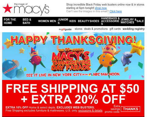
Subject Line: A- Happy Thanksgiving! Shop Black Friday online now! – This is a very straightforward subject line, but that’s actually a good thing. They are nicely sending good holiday wishes and telling you the sale is ready for you. It’s a little long, so maybe “Shop Black Friday now!” would have sufficed.
Relevance: B+ They are talking the holiday talk with the Thanksgiving Day Parade and their weekend sales.
Creative: C- There’s way too much going on and too many conflicting messages. If they wanted shopping to be the focus, the parade should have been in the recovery module, and not the first thing people see. Plus the subject line pays off with shopping, not the parade. The web buster sections are odd because the top one doesn’t have any imagery, which is so important, but the bottom section has images but without categories to know what you’re looking at. They could have done a much better job combining the section. So “Women” could be a header with the diamond earrings or boots showing and “Home” could have been another header with the vacuum cleaner.
CTA: B They did a good job of including a CTA in each product box, but they don’t have a strong CTA above the fold.
2. Joy Stride Rite
Subject Line: C UGGS 20% OFF BLACK FRIDAY SALE LIMITED QUANTITIES – Plain and simple, this subject line is too long. “20% off Uggs- Limited Quantities” would have been better. Plus they don’t need to make the whole things capitalized because it looks like they are screaming at me. No one wants to be screamed at.
Relevance: C Other than using the word Black Friday, there is no connection to the holidays or anything remotely festive.
Creative: D This does not look like a professional email. They get the message across that Uggs are on sale, but their product imagery is not upscale and it doesn’t do a good job of showcasing the products in the best light possible. The second part of the email doesn’t even feel like it goes with the top part. Plus they have no links to a landing page or website. SIGH.
CTA: F Non existent. They are assuming that I’m going to see this deal and go running for the store. Bad assumption. I want to be able to take action on this awesome sale right away from the comfort of my own couch in my Snuggie with a Clearasil mask on my face.
3. James Perse
Subject Line: B- The Online Holiday Sale Has Arrived! Up to 70% Off and Free Shipping – Hate to be repetitive, but this is too long and trying to do too much. Free Shipping is table stakes now, so that can be removed. Good signal that it’s going to be about holiday though.
Relevance: B They use holiday sale wording in the email multiple times so the creative plays off the subject line.
Creative: C Huh? It’s nice and simple, but how does that black and white picture of the ocean have anything to do with the holidays? Sometimes its good to go against the grain, but when I received this email, it felt forced like that’s exactly what they were doing. No product imagery, and no holiday imagery… they can do better and they could definitely be more creative.
CTA: C- You can click on the holy water (hehe) image to be taken to their site, but they need a CTA button that says Shop Now or Buy Now or something, especially since the image is so simple, it would really stand out and encourage the customer to take the next step.
Overall, each of the emails above had their strengths and their weaknesses. The goal for each company was essentially the same: cut through the holiday clutter and get their messages heard. Since the holidays aren’t over yet, the not-so-great emails can easily course correct by:
- Using a subject line that grabs attention in the email AND relates to the holiday sale/promo they’re pushing. Trying to include something witty in that messaging always helps too!
- Ensuring their creative is on brand, but also incorporates some of the holiday spiritwe’re all experiencing right now. Using high end imagery that puts their product in the best light
- Using a clear call-to-action to make sure the reader knows what the next step is they’re supposed to take
Browse our Services


